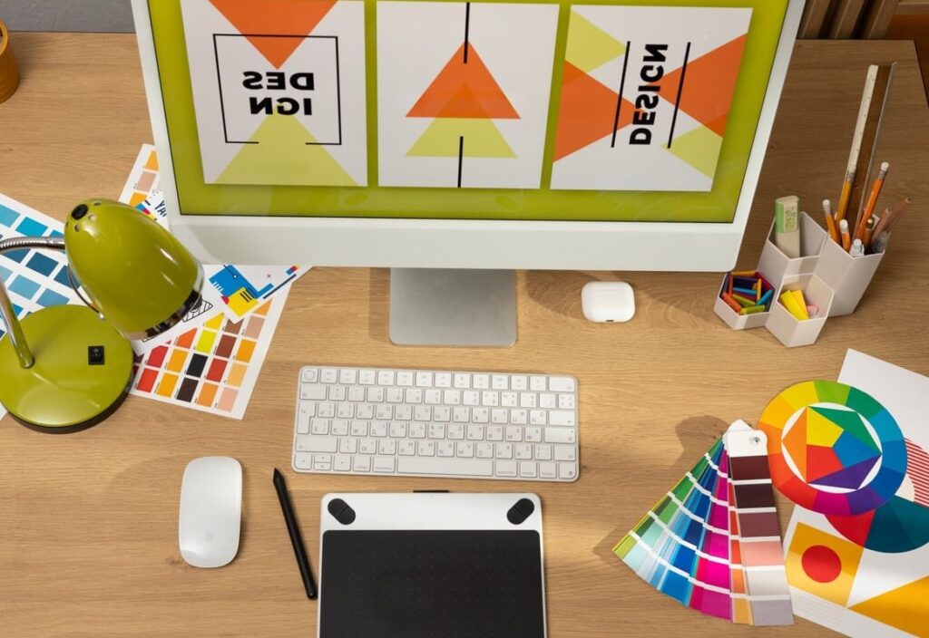
Logo Design for Bakery: 9 Style Ideas and Color Tips That Sell

Your bakery logo is the first thing customers see, on your storefront, your boxes, your Instagram feed and your loyalty cards. A great logo design for bakery brands does more than look pretty: it communicates flavor, craft and personality in a single glance. This practical guide walks you through 9 style directions, the colors that trigger appetite, and the font pairings that will help you brief a designer (or a logo maker) with clarity. Why Your Bakery Logo Matters More Than You Think Bakeries operate in a crowded, sensory-driven market. Customers often choose where to buy their morning croissant based on visual cues alone. A logo that feels warm, artisanal or playful can position you above competitors who rely on generic clip-art. Before you open a logo maker or hire a designer, take time to define: Your bakery’s personality (rustic, premium, fun, healthy, French, vegan) Your ideal customer (families, foodies, office workers, brides ordering wedding cakes) Where the logo will appear most often (signage, packaging, social media, paper bags) 9 Logo Design Styles for Bakeries (With When to Use Each) 1. Vintage & Heritage Think old apothecary labels, banners, badges and est. dates. Perfect for bakeries that want to communicate tradition, family recipes or sourdough mastery. Best for: Artisan bread shops, family-run patisseries Visual cues: Wheat stalks, rolling pins, ribbons, serif typography 2. Hand-Drawn & Illustrative Sketchy lines, watercolor textures and personal flourishes feel handmade, just like your pastries. Best for: Cupcake shops, custom cake studios, home bakers going pro Visual cues: Whisks, piping bags, hand-lettered names 3. Modern Minimal Clean geometry, lots of white space, and one strong icon. Reads beautifully on packaging and Instagram. Best for: Specialty coffee bakeries, healthy or gluten-free brands Visual cues: Single-line icons, sans-serif type, monochrome palettes 4. Playful & Cartoon Bright colors, smiling characters, bouncy lettering. Instantly appealing to families and children. Best for: Cookie shops, donut bars, kids’ cake shops 5. French Patisserie Elegance Refined script, gold accents, soft pastels. Communicates luxury and craftsmanship. Best for: Macarons, wedding cakes, high-end pastry boutiques 6. Rustic Farmhouse Kraft paper textures, stamps, natural elements. Says “locally sourced” without saying a word. Best for: Sourdough bakeries, farmers’ market sellers 7. Geometric Monogram A stylized initial inside a circle, hexagon or shield. Versatile and ownable. Best for: Bakeries with long names, multi-location brands 8. Typographic / Wordmark The bakery name itself becomes the logo, with a custom letter twist. Best for: Brands with memorable names, modern urban bakeries 9. Mascot or Character A signature character (a chef, a happy loaf, a cat baker) adds storytelling power. Best for: Brands building a strong personality on social media Color Psychology for Bakery Logos Color is not decoration, it is communication. Here are the most effective palettes for food brands: Color Emotion It Triggers Best Bakery Style Warm Brown Comfort, tradition, chocolate, coffee Vintage, rustic Soft Pink Sweetness, romance, indulgence Patisserie, cupcakes Cream & Beige Natural, fresh, wholesome Artisan, organic Mustard / Gold Butter, warmth, premium feel French elegance Sage Green Healthy, natural, calm Gluten-free, vegan Deep Red Appetite, energy, urgency Donuts, pies, classic Black & White Modern, sophisticated Minimal, urban Pro tip: Avoid pure cold blues, they suppress appetite. If you love blue, soften it with cream or warm accents. Font Pairings That Work for Bakeries A logo usually combines two fonts: one for the bakery name, one for the tagline or “established” line. Here are pairings that consistently look professional: Playfair Display + Lato: Elegant serif with a clean sans, perfect for upscale patisseries. Lobster + Open Sans: Friendly script + neutral sans, ideal for cupcake or cookie shops. Bebas Neue + Cormorant: Bold modern + classic serif, great for urban artisan brands. Sacramento + Montserrat: Romantic handwritten + geometric sans, works beautifully for wedding cake studios. Abril Fatface + Karla: Statement serif + minimal sans, a balanced editorial look. Quick Font Rules Never pair two scripts together Keep enough contrast between weights Test legibility at small sizes (your logo on a business card) Avoid overused fonts like Papyrus or Comic Sans How to Brief Your Designer (Or Logo Maker) Once you have an idea of your style, color and fonts, write a short brief covering: Your bakery name and tagline 3 adjectives describing your brand (e.g. warm, handcrafted, elegant) 3 logos you love and why (mood board from Pinterest or Dribbble) 3 logos you dislike in your industry Where the logo will be used most: signage, packaging, online Color palette preferences and any to avoid Final deliverables needed: vector files, social media versions, black & white version Common Mistakes to Avoid Too many elements: A wheat stalk + chef hat + rolling pin + cake = visual noise. Trendy fonts that age fast: Pick timeless type, not whatever is trending in 2026. Ignoring scalability: Your logo must work on a 2 cm sticker and a 3 m storefront. Copying competitors: Inspiration is fine, imitation hurts your brand. Skipping the black & white test: A strong logo works without color too. Where to Get Your Bakery Logo Designed Depending on your budget, you have three main routes: Option Budget Best For DIY logo maker (Canva, Looka, BrandCrowd) Free to $50 Pop-ups, market stalls, testing a concept Freelance designer (Fiverr, Upwork, Dribbble) $150 to $1500 Most small bakeries opening a real shop Branding agency $3000+ Multi-location bakeries, premium positioning FAQ: Logo Design for Bakery Owners How much should a small bakery spend on a logo? Most independent bakeries spend between $200 and $800 for a quality logo from a freelance designer. If your budget is tight, a logo maker can produce a decent starting point for under $50. What file formats should I ask for? Always request vector files (AI, SVG, EPS) plus PNG with transparent background and PDF. Vector files let you print your logo at any size without losing quality. Should my bakery logo include an icon or just text? Both work. A wordmark (text only) is easier to read on signage. An icon plus text
Questions to Ask a Web Designer Before Hiring: 15 Essential Questions

Why You Need to Ask the Right Questions Before Hiring a Web Designer Hiring a web designer is one of the most impactful decisions you can make for your business. A great website builds trust, attracts customers, and drives revenue. A poorly executed one wastes your budget and sets you back months. The problem? Most business owners don’t know what to ask before signing a contract. They get impressed by a flashy portfolio, agree to vague terms, and end up with a site that doesn’t meet their needs, a bill that keeps growing, or worse, a design they don’t even own. This guide walks you through 15 essential questions to ask a web designer before hiring them. We’ve organized them into clear categories so you can evaluate any designer or agency with confidence, whether you’re building your first website or redesigning an existing one. Process and Approach Before anything else, you need to understand how the designer actually works. A smooth process leads to a smooth project. A chaotic one leads to missed deadlines, miscommunication, and frustration. 1. What Is Your Design and Project Management Process? Every reputable web designer should be able to walk you through their process step by step. If they can’t clearly explain how a project moves from kickoff to launch, that is a red flag. Look for answers that include: A discovery or strategy phase Wireframing or mockups before full design Defined milestones and checkpoints A project management tool they use (like Asana, Trello, or Basecamp) Clear communication channels and response times A designer who has a documented process is far more likely to deliver on time and within budget. 2. What Kind of Research Will You Do on Our Business? Your website should not be designed in a vacuum. A good designer takes the time to understand your industry, audience, competitors, and goals before opening any design software. Ask them specifically: Will you review our competitors’ websites? Do you research our target audience’s preferences? Will you audit our current site (if we have one) before starting? If a designer jumps straight to visuals without understanding your business, the result will look generic. 3. What Do You Need From Me Before the Project Starts? Web design is a collaborative process. You’ll likely need to provide content, brand assets, login credentials, and feedback at various stages. Knowing this upfront helps you prepare and prevents delays. Typical items a designer might request: Brand guidelines, logos, and color codes Written content or copy for each page High-resolution photos or image direction Access to hosting, domain registrar, or existing CMS Examples of websites you like (and why) Technical Skills and Customization Not all web designers build websites the same way. Some use drag-and-drop templates. Others code from scratch. The approach they take affects your site’s performance, flexibility, and long-term value. 4. Do You Use Pre-Built Themes or Build Fully Custom Websites? This is a critical question that directly impacts your budget and the uniqueness of your site. Approach Pros Cons Pre-built theme Lower cost, faster launch Less unique, limited flexibility Semi-custom Good balance of cost and customization May still have theme limitations Fully custom Completely tailored to your brand and goals Higher cost, longer timeline Neither approach is inherently better. What matters is that the designer is transparent about what you’re getting. 5. What CMS or Platform Do You Build On? The content management system (CMS) determines how you’ll manage and update your website after launch. Common platforms include WordPress, Webflow, Shopify, Squarespace, and others. Key follow-up questions: Why do you recommend this platform for my business? Will I be able to edit content myself without technical skills? Are there ongoing licensing or subscription fees? Is the platform scalable as my business grows? 6. How Do You Handle SEO and Website Performance? A beautiful website is worthless if no one can find it. Ask the designer about their approach to search engine optimization and site speed. Specifically, make sure they address: On-page SEO basics (title tags, meta descriptions, heading structure, alt text) Mobile responsiveness Page loading speed optimization Clean URL structures Schema markup (if relevant to your industry) If the designer says “SEO is not part of our scope,” that is something you need to plan for separately, and it should influence your budget. Pricing and Budget Money conversations can feel uncomfortable, but they are absolutely necessary. Vague pricing leads to scope creep and unexpected invoices. 7. Do Your Services Fit Within Our Budget? Be upfront about your budget range early in the conversation. A good designer will tell you honestly whether they can deliver value within that range or if your expectations need adjusting. Don’t be afraid to share your number. It helps both sides avoid wasting time. 8. What Exactly Does the Quote Include? This is where many business owners get burned. A quote might look reasonable until you realize it doesn’t include copywriting, stock images, a mobile version, or any revisions. Make sure the quote clearly breaks down: Number of pages included Content creation or copywriting (included or separate?) Stock photography or image sourcing Number of revision rounds Contact forms, integrations, or special features Training on how to use the site Launch support Get this in writing. A detailed proposal protects both you and the designer. 9. Are There Any Ongoing Costs After Launch? Many business owners are surprised to learn that their website comes with recurring fees. These can include hosting, domain renewal, plugin licenses, maintenance, security updates, and CMS subscriptions. Ask specifically: Will I need to pay for hosting separately? Are there premium plugins or tools with annual fees? Do you offer a maintenance plan, and what does it cost? What happens if I choose not to use your maintenance service? Revisions and Feedback How a designer handles feedback and revisions can make or break your experience. 10. How Many Rounds of Revisions Are Included? Some designers offer unlimited revisions. Others include two or three rounds. And some charge by the hour for
Best Colors for Wellness Brand Identity: How to Choose the Right Palette
Why the Best Colors for Wellness Brand Identity Can Make or Break Your Business Color is the very first thing your audience notices. Before they read your tagline, browse your services, or book an appointment, they feel something based on the colors you present. For wellness brands like spas, yoga studios, holistic health practices, and meditation centers, that first feeling matters more than almost anything else. Choosing the best colors for a wellness brand is not just an aesthetic exercise. It is a strategic decision rooted in psychology, audience expectations, and market positioning. The right palette builds instant trust, communicates your values, and attracts clients who are already looking for the calm, healing, and renewal you offer. In this guide, we break down exactly which colors work best for wellness brands, why they work, and how to combine them into a cohesive palette that sets you apart from the competition. Color Psychology: Why It Matters So Much for Wellness Brands Color psychology is the study of how colors influence human emotions, behaviors, and perceptions. In the wellness industry, where the entire business model revolves around how people feel, color choices carry even more weight than in other sectors. Research consistently shows that people form an opinion about a product, space, or brand within 90 seconds, and up to 90% of that initial assessment is based on color alone. For a wellness brand, this means your color palette is essentially doing the emotional heavy lifting before a single word is read. Here is what makes wellness branding unique from a color perspective: The goal is emotional resonance. Clients seek relaxation, healing, clarity, or transformation. Your colors need to mirror those desires. Trust is non-negotiable. People entrust wellness professionals with their physical and mental health. Colors that feel cheap, aggressive, or chaotic will push potential clients away. Sensory experience starts online. Whether someone finds you on Instagram or your website, the visual palette sets expectations for the in-person experience. The Best Colors for Wellness Brands: A Deep Dive Let’s explore the individual colors that consistently perform well in the wellness industry, along with the specific emotions they evoke and the types of businesses they suit best. 1. Green: The Universal Color of Health and Growth Green is arguably the most strongly associated color with health, nature, and renewal. It signals vitality, balance, and a connection to the natural world. This makes it an excellent anchor color for almost any wellness brand. Best for: Holistic health practices, nutrition and dietitian services, herbal medicine brands, eco-conscious wellness studios, and nature-based retreats. Recommended shades: Sage green for a soft, modern, and approachable feel Deep forest green for luxury and grounded sophistication Mint green for a fresh, clean, and youthful vibe 2. Blue: Calm, Trust, and Serenity Blue conveys calmness, trust, and professionalism. It is the color most associated with serenity and is widely used across healthcare and mental health spaces. For wellness brands, blue creates an immediate sense of peace. Best for: Meditation apps and studios, therapists and mindfulness coaches, skincare brands, and water-based spa experiences. Recommended shades: Soft sky blue for openness and tranquility Teal for a fresh, creative, and slightly energetic twist Misty blue for an ethereal, dreamy quality 3. Purple: Spirituality and Transformation Purple has deep historical ties to spirituality, wisdom, and transformation. It is a go-to choice for wellness brands that lean into the spiritual side of health, including energy healing, chakra work, and mindful living. Best for: Reiki and energy healing practices, spiritual coaching, luxury wellness retreats, and aromatherapy brands. Recommended shades: Lavender for softness and relaxation Deep plum for richness and luxury Dusty mauve for a grounded, modern spiritual brand 4. White and Cream: Purity, Clarity, and Simplicity White symbolizes purity, cleanliness, and a fresh start. In wellness branding, it is often used as a dominant background color that allows other elements to breathe. Cream and off-white variations add warmth without sacrificing the clean aesthetic. Best for: Minimalist wellness brands, clinical wellness spaces, skincare lines, and any brand that wants to communicate simplicity and clarity. 5. Earth Tones: Warmth, Honesty, and Human Connection Terracotta, sand, warm beige, and pale linen tones have become increasingly popular in the wellness space. These colors signal honesty, care, and a human-centered approach. They feel warm, inviting, and grounded without being overly clinical. Best for: Yoga studios, bodywork and massage therapy, women’s health brands, and brands that emphasize a personal, boutique experience. Recommended shades: Terracotta for warmth and authenticity Sandy beige for a coastal, serene feeling Warm taupe for understated elegance 6. Soft Pinks and Corals: Nurturing and Compassion Soft pink tones evoke feelings of nurturing, compassion, and emotional safety. Coral adds a touch of energy and playfulness without being overwhelming. These shades work particularly well for brands focused on self-care, women’s wellness, and emotional well-being. Best for: Self-care subscription boxes, prenatal and postnatal wellness, emotional wellness coaching, and beauty-meets-wellness brands. 7. Gold and Warm Metallics: Luxury and Premium Positioning If your wellness brand sits at the luxury end of the market, gold accents and warm metallic tones can elevate your palette instantly. Used sparingly, they communicate exclusivity, quality, and a premium experience. Best for: High-end spas, luxury wellness retreats, premium product lines, and VIP wellness memberships. Color Combinations That Work: Wellness Palette Ideas Individual colors are important, but the real magic happens in how you combine them. Below are five proven palette combinations for different types of wellness brands. Palette Name Colors Mood Ideal For Coastal Calm Soft blue, sandy beige, cream, white Peaceful, serene, open Beach spas, meditation studios Forest Retreat Deep green, misty blue, off-white, charcoal Grounded, quiet, strong Nature retreats, holistic health Warm Earth Terracotta, pale linen, sage green, warm taupe Honest, nurturing, approachable Yoga studios, bodywork practitioners Spiritual Glow Lavender, deep plum, gold, cream Mystical, luxurious, transformative Energy healing, spiritual coaching Modern Minimalist White, soft grey, blush pink, black accents Clean, sophisticated, contemporary Skincare brands, clinical wellness Real-World Wellness Brand Color Examples Looking at successful wellness brands can
Best Colors for Financial Website Design: Building Trust Through Color Psychology

Why Color Matters More Than You Think on Financial Websites When someone lands on a financial services website, they make a subconscious judgment within 50 milliseconds. Before they read a single word about your fees, credentials, or investment philosophy, color has already told them whether your brand feels trustworthy or not. Choosing the best colors for a financial website is not just about aesthetics. It is about psychology, conversion, and credibility. The wrong palette can quietly push visitors away, while the right one can reinforce the exact message you want to send: “Your money is safe with us.” In this guide, we break down the psychology behind the most effective financial website colors, provide 12 ready-to-use palettes with hex codes, and explain how to apply them whether you run a bank, an accounting firm, or a fintech startup. The Psychology of Color in Financial Services Color psychology is not guesswork. Decades of research show that different hues trigger different emotional responses. In the financial industry, where trust, stability, and professionalism are non-negotiable, certain colors consistently outperform others. Blue: The Universal Trust Signal Blue dominates finance for a reason. It is associated with reliability, calm, and security. Think of Chase, American Express, PayPal, and Visa. They all lean heavily into blue because it lowers anxiety and encourages confidence. Dark navy blue conveys authority and institutional strength Medium blue feels approachable yet professional Light blue adds a modern, tech-forward feel (popular with fintech brands) Green: The Color of Money and Growth Green has an obvious connection to money, but it also signals growth, balance, and prosperity. It is especially effective for investment firms, wealth management platforms, and accounting businesses that want to emphasize financial health. Deep emerald green suggests wealth and exclusivity Muted sage green feels calm and contemporary Bright green adds energy and is common in fintech apps Neutrals: The Professional Foundation Charcoal, slate gray, off-white, and beige serve as the backbone of nearly every successful financial website. They create visual breathing room, let primary colors stand out, and project sophistication without distraction. Purple: A Rising Star in Fintech Once rare in finance, purple has surged in popularity thanks to brands like Nubank and Plum. It communicates innovation, premium quality, and creativity, making it ideal for fintech companies that want to differentiate from traditional institutions. Gold and Warm Tones: Signaling Premium Value Gold, amber, and warm browns suggest prestige, legacy, and high-end service. These tones work beautifully for private banking, luxury wealth management, and firms targeting high-net-worth clients. Colors to Use with Caution Not every color belongs on a financial website. Here is a quick reference: Color Perception in Finance Recommendation Red Urgency, danger, loss Use sparingly for CTAs only Orange Playful, informal Can work for budget-friendly fintech Yellow Caution, optimism Best as an accent, never dominant Pink Soft, unconventional Risky for traditional finance audiences 12 Financial Website Color Palettes with Hex Codes Below are 12 curated palettes grouped by the message you want your financial website to communicate. Each palette includes primary, secondary, accent, and background colors so you can implement them immediately. 1. Classic Corporate Blue Best for: Banks, credit unions, institutional finance Primary Navy Blue #1B3A5C Secondary Steel Blue #4A7FB5 Accent White #FFFFFF Background Light Gray #F4F6F8 2. Wealthy Greens Best for: Investment firms, wealth management, retirement planning Primary Deep Emerald #1A5632 Secondary Forest Green #2E8B57 Accent Gold #D4A847 Background Warm White #FAFAF5 3. Modern Fintech Blue Best for: Fintech apps, digital-first banking, neobanks Primary Electric Blue #2563EB Secondary Sky Blue #60A5FA Accent Coral #F87171 Background Near White #F9FAFB 4. Trustworthy Neutrals Best for: Accounting firms, CPAs, tax professionals Primary Charcoal #2D3436 Secondary Slate Gray #636E72 Accent Teal #00B894 Background Off-White #F5F5F0 5. Prosperity Purple Best for: Innovative fintech, digital wallets, crypto platforms Primary Royal Purple #6C3483 Secondary Lavender #A569BD Accent Mint Green #58D68D Background Pale Lavender #F4ECF7 6. Golden Investments Best for: Private banking, luxury financial services, estate planning Primary Deep Gold #B8860B Secondary Dark Brown #3E2723 Accent Cream #FFF8E7 Background Ivory #FFFEF9 7. Blue and Green Harmony Best for: Financial advisors, holistic financial planning Primary Ocean Blue #1A73B5 Secondary Soft Green #27AE60 Accent Light Teal #76D7C4 Background Cool White #F0F7FA 8. Bold and Authoritative Best for: Trading platforms, market analysis, financial media Primary Black #1A1A2E Secondary Crimson Red #E63946 Accent White #FFFFFF Background Dark Slate #16213E 9. Calm Advisor Best for: Personal finance blogs, retirement coaches, insurance Primary Dusty Blue #5B8FA8 Secondary Sage #A8BBA0 Accent Warm Beige #D4C5A9 Background Soft Cream #FAF8F5 10. Gradient Tech Best for: AI-powered finance tools, robo-advisors, payment platforms Primary Indigo #4F46E5 Secondary Violet #7C3AED Accent Cyan #06B6D4 Background Near Black #0F172A 11. Earthy Stability Best for: Community banks, credit unions, local financial advisors Primary Warm Brown #6D4C41 Secondary Terracotta #C0785C Accent Olive Green #7D8C4E Background Linen #FAF0E6 12. Monochrome Sophistication Best for: Hedge funds, private equity, minimalist brand identities Primary Rich Black #0D0D0D Secondary Medium Gray #6B7280 Accent Silver #C0C0C0 Background Pure White #FFFFFF The 3-Color Rule for Financial Websites One of the most common questions designers ask is: “How many colors should I use?” The answer for financial websites is simple: follow the 60-30-10 rule. 60% dominant color – This is your background and largest visual area. Usually white, off-white, or a very light shade of your primary color. 30% secondary color – This is your primary brand color used for headers, navigation bars, footers, and section backgrounds. 10% accent color – This is reserved for calls to action, buttons, links, and critical UI elements that need to stand out. Limiting yourself to three core colors prevents visual clutter and reinforces professionalism. Financial websites that use too many colors often feel disorganized, which is the last thing a potential client wants to see from someone managing their money. How to Choose the Right Colors for Your Specific Financial Niche Not all financial businesses serve the same audience. Your color choices should reflect your specific positioning: For Financial Advisors Financial advisors need to balance warmth and authority. Clients are trusting